This I don’t know if it will work or if we like with sorting is dependent on Volumio itself to first implement it - but would it be possible to add a ”go to artist" function when you are viewing an album (in Qobuz, Spotify - & Tidal)?
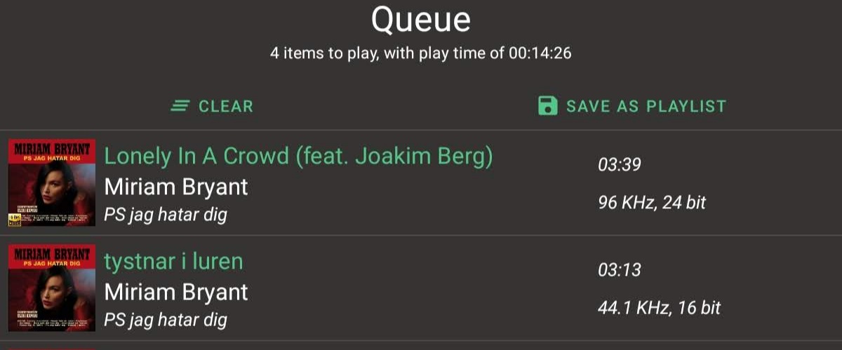
Yes, queue tracks does show the icon(it’s not baked in the cover art, but instead image on top of image, which is shown if the track contains some information that i can say it’s high res), that is because the tracks in queue do return more information from the backend, than ordinary tracks you see while browsing the different sections.
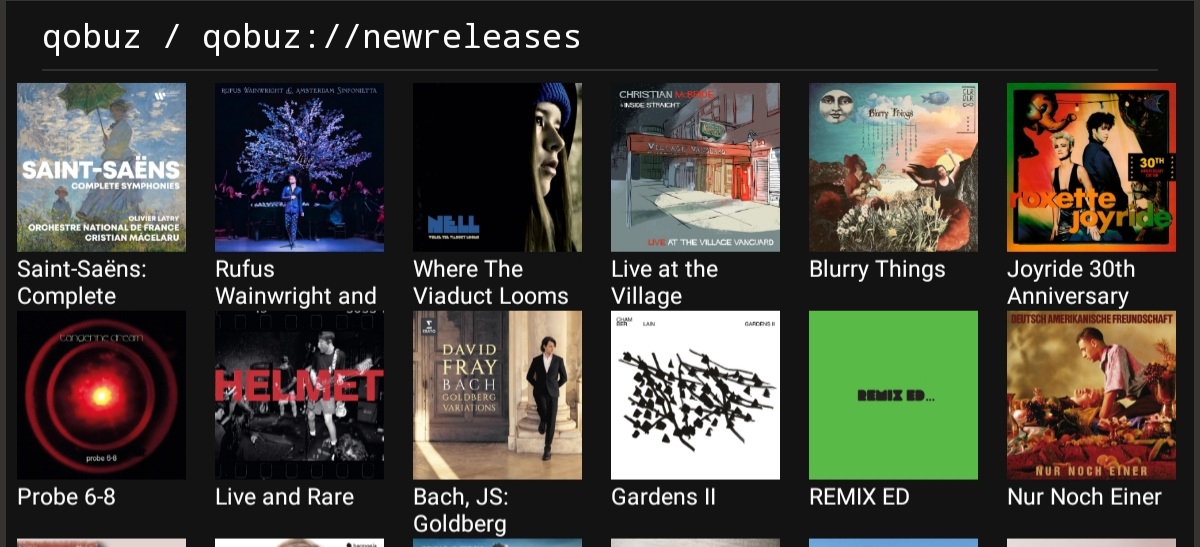
navigation/browsing is now optimised and is equally fast across the board, if only one type of items are shown in either grid or listview.
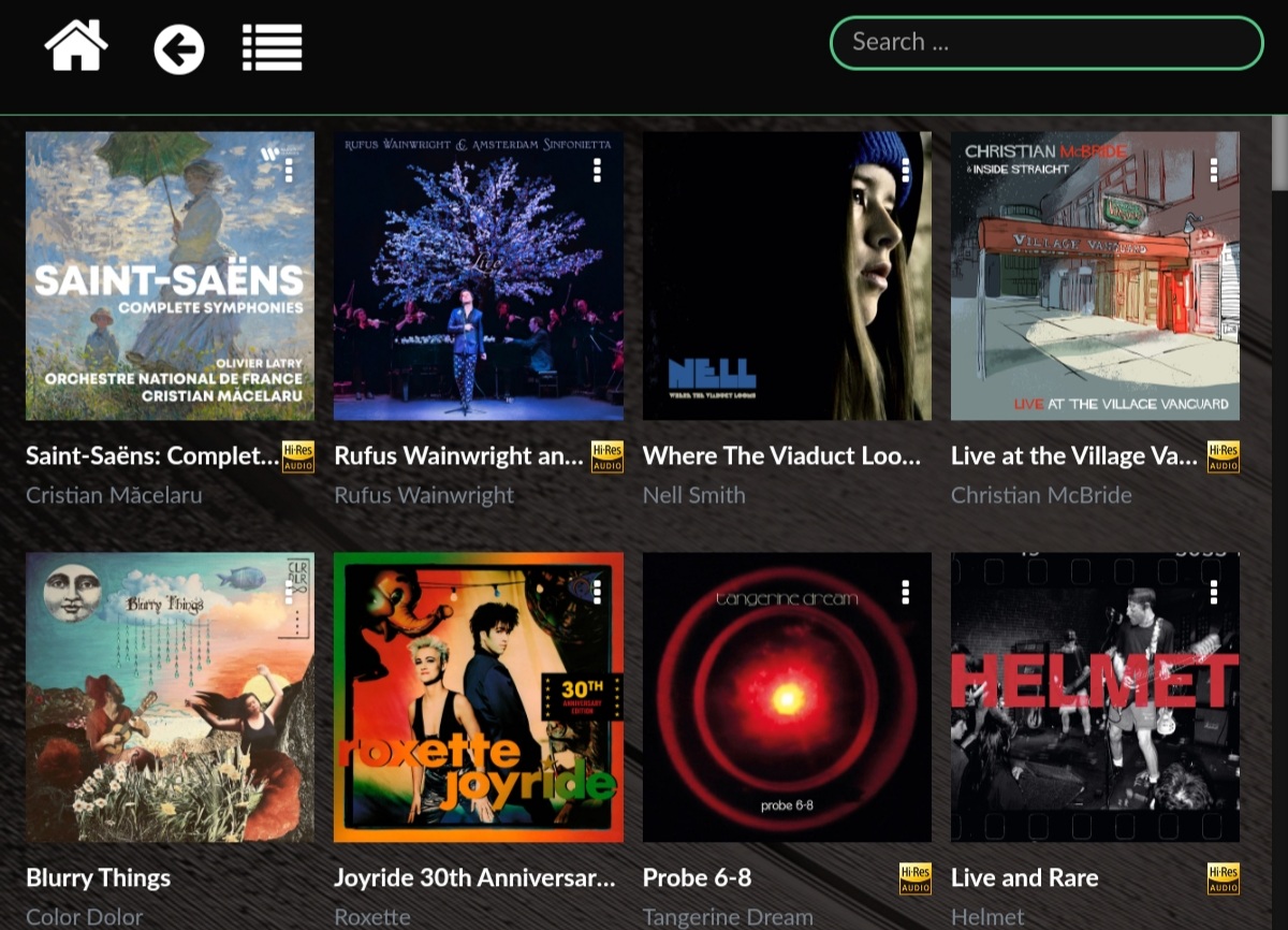
hi-res marker genearalised for all content, it’s shown if the data is available, regardless of content type or view on the app.
webradio stations shown in listview instead of grid view, which result in longer station names shown, aswell as extra info about the station.
Edit: Favourites section now shows Albums/Playlist and Artist aswell, splitted by tabs, propably add radios too.
(This is only for Tidal/Qobuz/Spotify)
Im almost done with the next update, just need some testing that it would work properly.
I also need to study the volumio code a bit, to know if it can withstand ~15 parallel calls the some of its endpoints, to make the app bit faster with the new addition of centralised Favourite handling etc.
Edit: it seems that the backend can handle parallel request’s on PI4 atleast just fine.
i managed to cut the time of fetching favourites on my system from ~3.4s all the way down to ~0.7s which is quite huge improvement.(this time includes fetching favorite Albums, Artist and Tracks from tidal, qobuz and spotify/local and all the parsing and transformations i need to make for the data so that my UI can show it)
Well, the base theme applied is material design theme, but i don’t think there is much left from that anymore. (So i guess in the end the answer would be no)
The app looks great.
One strange behavior though. If I use the screen to see what is currently playing (playback) and rotate from landscape to portrait or vice versa, it falls back to browse screen:
You have more freedom to do designchoices that takes advantage of Android, touch screens etc.
The official app seems to follow the new Manifest UI quite strictly, so some design choices they made seems a bit strange in the app - like that the device back button takes you all the way back to where you choose your device and not the previous page.
So I will stick with your app as long you feel that you have the time and energy to develop & maintain it!
Let’s see what i can do for the list thing, should not be too much work.
About the volumio settings, I’ve looked into it multiple times and done some testing and can say that is a lot of work to do for in my opinion very small gain, after all how often something needs to changed from within the settings after initial setup.
I will add the device settings eventually but currently it’s in the very bottom of to do list.