Depending on the resolution on the device displaying the page, a popup button could also work. [0-9 - Z] like a square box you click the letter and it takes you to the letter of the artist you selected.
I would like to thank all the developers for staying on top of this project and striving to continue to make it better. For so long people have been trapped using iTunes, Jrivers, or buying overpriced buggy,unfinished, lack of updates HIfi music systems, I’ve used Olive music servers, Cocktail Audio and the worst player ever Nativ Vita. Volumio is simple, works perfectly
Good! It would be interesting to have the bitrate also in the album view, since in an album normally the tracks have the same bitrate. The choice by letter of the alphabet is also excellent!
Amazing!
2 questions: can you get in touch with us at info at volumio dot org ?
then I am really curious to hear what you did not like about Nativ VITA, I always looked at it as a wonderful piece of design…
Use the mouse or finger on touch screen to slide the bar to the selector to pick the letter you want. After you release the webpage goes to that letter.
When you lets say looking at steve miller band, you click back, it takes you back to the top of the list. Possible to return on the section you were looking at.
I look forward for this feature! Awesome!
With a library of more than 1000 albums this a must for me.
Is there any way to implement this in my present volumio version ?
There are two things that keep me from using volumio… I keep trying it now and then and while I love the sound… the user experience frustrates me bad. I use this in a car and compete in competition.
This is on the alternative display.
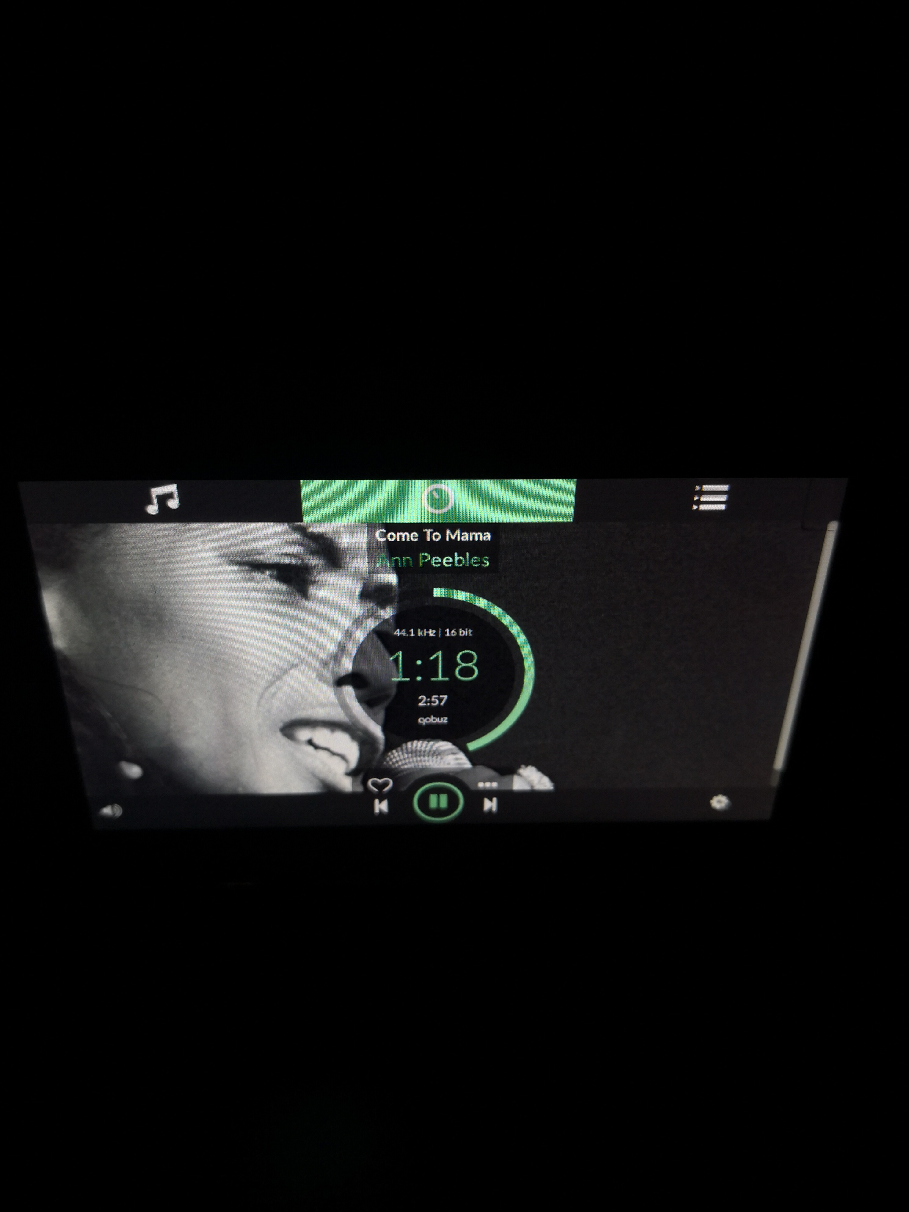
If I’m in say tidal… nav to a playlist… Find a song and play it … it will not play from there. It goes back to some other list. Will not play the next songs in that playlist…
2 The next and back buttons need spread out and moved away from track progress bar… Impossible to use while driving! The default display is better but I can’t reach those without leaning way forward.


 it will be just awesome