While Volumio3 (“contemporary”) is better in a desktop browser, I like the player view in “classic” theme much better on a 7’’-touch display (you don’t have to activate the volume slider btw). In regards of user experience you should offer the “classic” player view in “contemporary” theme as well. It looks much cooler as well. Another thing: I would prefer very much to see the actual bitrate (e.g. 320kbps) to the bit depth (24bit) of an audio file.
I find the “Contemporary” view difficult on mobile - can’t see how to navigate to different playback zones for example. Would be good if you could choose Classic for mobile and Contemporary for desktop.
I second [hli] vote. Old mobile theme is cleaner. It allows one click transition between library and queue.
So if there are opposite votes it would be good to split console and mobile theme selection to two options. This way anyone would be able pick what he/she likes for particular output best.
“classic” theme seems better to me.
if they make a new theme let’s auto hide parts like the bar of waitinglist outputs and little speaker
if set you will not see it any more only on a mouse over or a other way this is taking a lot of space
for nothing and the bad styling of it all makes it ugly… you can use many sliding menu’s let’s give that a try
instead of everything dead centered on screen…or set the album art as a background in a option?
then you got a lot of space gained…if your buzy with it make a option to remove the rounded corners.
1 Like
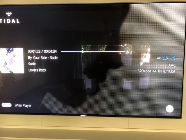
Agree and I posted the following in another post. What I don’t like: While it is awesome the pi and Volumio allow for a HDMI out to TV (or computer) I don’t like the display at all. Why show interface display when we already have that on the Web interface, MacBook or iPhone? Why not do a better TV image that is modern and sleek? I prefer the old classic apple screen display with album art on left then all the metadata and also the quality settings. The Onkyo does that and also adds a watermark image of the album art covering the entire screen. See pic attached. Having said that take classic is preferable to the new contemporary view.
Thoughts?
1 Like
this would be nice on youtube…
it should be nice to use instead of
https://i.ytimg.com/vi/fM7_jMD8EIM/hqdefault.jpg
to use this one called maxres…
https://i.ytimg.com/vi/fM7_jMD8EIM/maxresdefault.jpg
and set it as your background…