Not sure it is the right place where to post
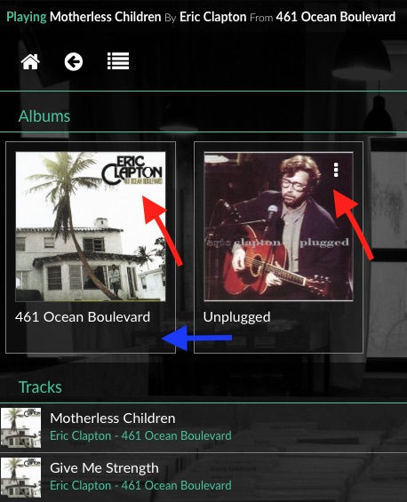
Want to say I really like the new UI, but found myself a bit puzzled, in a particular situation (a picture is better than blabla, so here it is)
Volumio 2.019-cubox.jpg
The three dots on top right hand side of the album picture, can hardly be spotted when this picture is white.
Ok, they turn green when you ave the cursor above it, but I find they are not so visible.
Why not placing these under the album picture, to make them easier to spot?
Also, on the playback tab, the 24 bit tracks I have are shown as 32 bit (i.e. I play a 24/96 song and it shows 32/96), independent from the bitrate.
Doesn t really bother me as the DAC shows the actual bitrate.
