Suggested improvement to Manifest UI (desktop/tablet view)

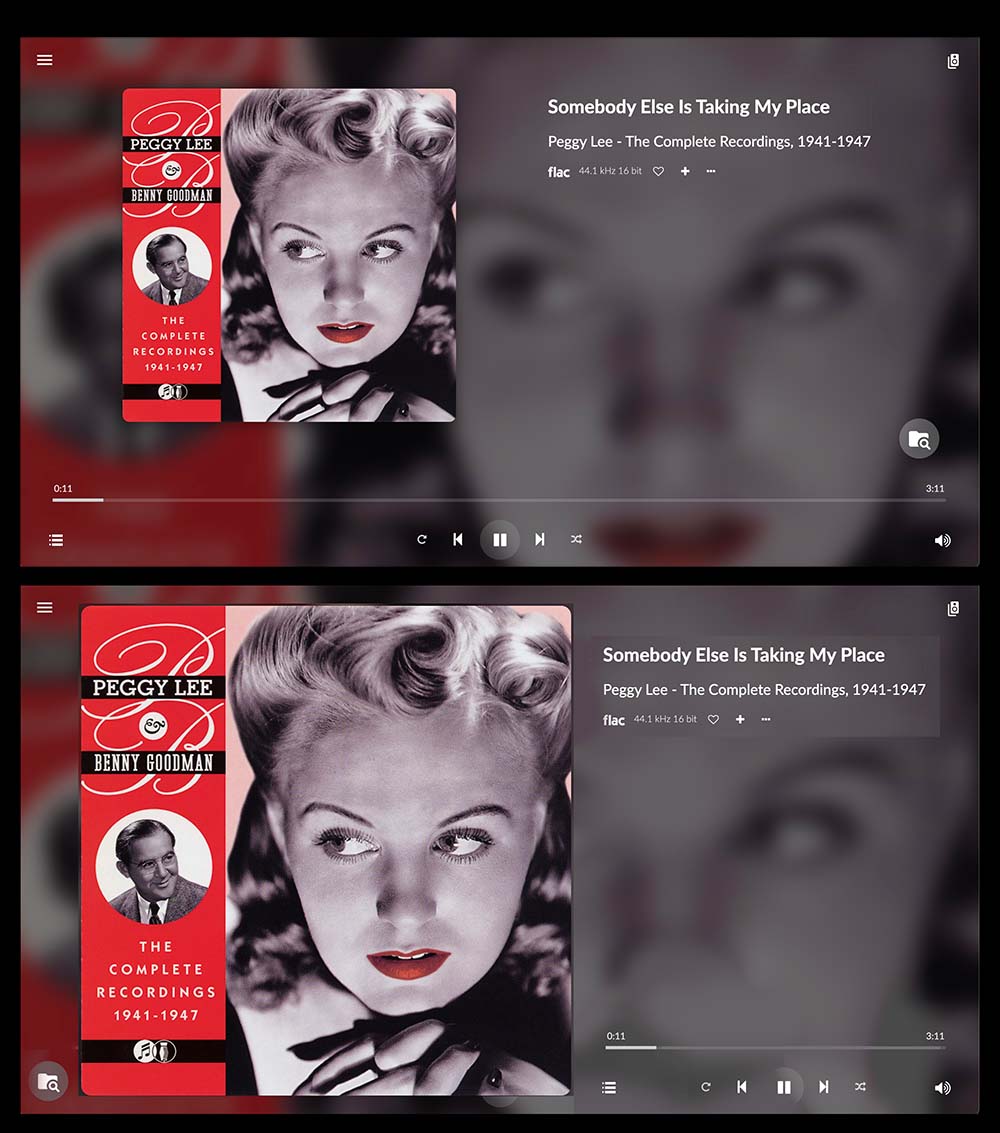
Manifest is a nice option but I also think there is room for improvement (in the desktop/tablet view). I made a quick mock-up below to show the idea. This loses nothing, and solves two problems:

  • the album art now covers more than double the screen area
  • when activated, the volume control no longer obscures the ‘browse’ icon

Before and after:

2 Likes

Best to move this to “Suggest a feature” topic.

Just curious - who are the decision makers when it comes to UI development like this?

In this case @mervinio as the Manifest UI is his brainchild :wink:

1 Like

Hi Voluminous,

Thanks for your suggestion. We could implement this as an extra mode for Manifest, i have put it on the wish list.

By the way we are looking for someone to make the next open source (free) UI for volumio. If you are interested you can start hacking right away!

1 Like

Good to hear from you @mervinio and that’s great news to hear that this is on the wish list!

Unfortunately my CSS and JS skills aren’t good enough for the open source UI project but I am happy to contribute ideas and Photoshop mock-ups if that helps.