I don’t like the current behaviour of the most important property of Volumio. Playing a song. My 2 players will add the complete album to the play-list. Even when I have “playback options -> general playback options -> playback mode” set to “single”. I assume that is a bug. I hope it will be fixed some day. But even when that works as expected, I still think we should be able to improve the user-interface.
One thing I don’t like is the precision with which you need to “click” on the menu icon. Of course, on my PC this is easy. However, I often control my 2 volumio-players with my 10" tablet. I’m not extremely “fat fingered”, but I manage to misclick at least one out of 10 times. I think if you “click” too much in the corner, you miss the menu-button.
So this is what I propose:
I think when selecting an album or an individual song, there can be 4 actions we might want to happen. Let me split them per song and per album:
Clicking on a song:
- add this one song to the play-list, and immediately start playing this song
- add the full album to the play-list, and immediately start playing this song
- add the song to the play-list, but don’t play it yet
- bring up the menu
Note: I never need option 2, but I’ve read here that there are people who like this. I don’t think it should be the default action. But I see no problem making this action easily selectable.
Clicking on an album:
- play the album, start with the first song, and add all songs from the album to the play-list
- play the album, add all albums by the same artist to the play-list
- add all the songs from the album to the play-list, but don’t play them yet
- bring up the menu
Note: I don’t think option 2 here makes sense.
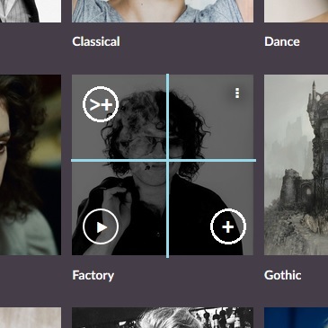
Anyway. It seems we have 4 main actions we want to be able to perform easily. For every song and every album. So I suggest that we we divide the “area” of the “album art” that indicates the song or the album, into 4 parts. Upper left, upper right, bottom left, bottom right. There is no middle area anymore. When clicking (with a mouse on PC, or with your finger on a touch-screen of a phone or tablet), you can only click on one of those 4 areas.
Then we show icons in each corner.
The right-hand upper corner shows the menu-icon (the “burger”).
Action: bring up the menu.
The left-bottom shows the play icon (the “>”).
Action: play the song/album and add it to the play-list.
The right-bottom shows the “add to play-list” icon.
I suggest we use something like a circle with a “+” in it.
Action: add the song/album to the play-list, but don’t play yet.
The left-upper corner shows the “play + add album to play-list” icon.
We need a new icon for this. Maybe “>+” in a circle or something.
Action for songs: play the song, and add the full album to the play-list.
Action for albums: play the song, and add the full album to the play-list (same as “+” button).
The result would look something like this:

And the "“click zones” would be something like this:

It would help to make sure nobody would mis-click as easily as can happen today.
I hope this suggestion is helpful.
If I wasn’t clear in what I meant, please ask, and I’ll try to be more clear.
Thanks in advance.