I want to choose by Composer, Artist, Conductor, Band, and WORK.
No classical music lovers in your team ???
Agree 100% about classical tagging!
What are you talking about? I didn’t share any screenshot nor do I use Qobuz. The data structure I provided IS the data structure Volumio created on my RPi PC and that inconsistently works.
I was replying to your opening paragraph on the remark “my music”.
Ah, ok. So why then is the data structure for “personal” different from that of “web” since web places the artist directly under the web folder? In other words, why is “artist” added beneath “personal” and then the actual artist name is added beneath that directory? And where is this documented?
Not really documented, as far as I know.
Just the way how it has been programmed. “web” folder holds data extracted from musicbrainz, “personal” can hold your own images, according this structure:
/data/albumart/personal/artist/<artist_name>/
/data/albumart/personal/album/<artist_name>/<album>/
Please see this posting : Artist View Images?
As we should not go off topic here.
1 Like
That seems like a significant improvement to me.
It saves a few mouse clicks. I look forward.
Volumio is the best!
1 Like
Hi Eduardo,
Been asking that here for many …years.
BTW, sorting is tooooo long.
So, I use RPi firmware/software (be it Volumio or else) only as a UPNP/DLNA peripheral, USB connected to my DAC (RME ADI-2 pro, that does other interesting things…).
Foobar 2000 rules and is lightning fast… but AFAIK there is no valid smartphone app 
I think that what I’m asking for needs more computer power.
Regards,
Wow, I’m really looking forward to it!
Not sure, but it’s probably wrong at this point…
It would be nice if the track length was displayed in the cue list.
2 Likes
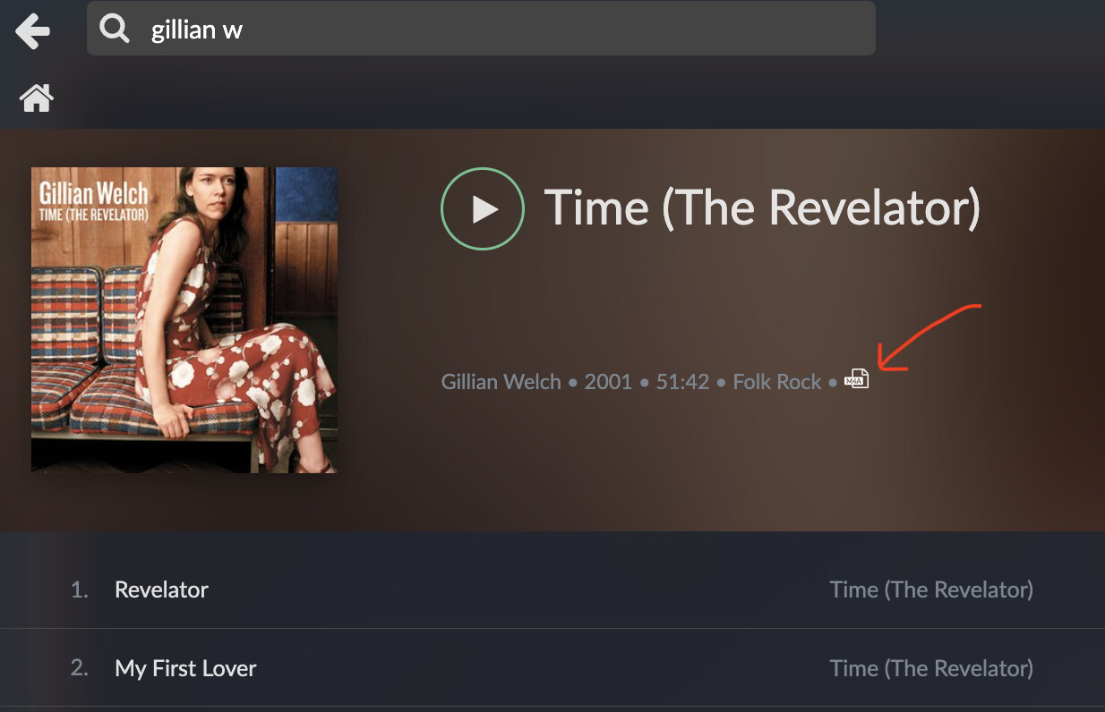
If album pages are involved in this redesign, I’d love to be able to see album tags more easily. My eyes are still pretty good but grey font is always a bit tough and, inparticular, the file type icon is microscopic.
Thank you all for the loads of feedback and suggestions. We will take everything into concideration and we will continue the development of the new browsing pages. We expect to release the first build in the beginning of Q2.
Please concider that because of the scope of this project we are not able to implement all improvements suggested. Everything that we can not implement in the next release will be implemented in the next major volumio release, based on a new codebase.
Progress on the development will be posted here, please keep your feedback coming.
6 Likes
Yes for the love of God…
My tags and metadata are all perfect but it still don’t seem to recognise and group VA alums as the one album (eg when searching it says 20 albums instead of 1, and also stops playing after the first track).
Thanks
Ps also have been using foobar since they 2000 for my own FLAC playback at PC, and like how it operates (and very fast). Obviously streaming will be slower when searching various sources but could be worth seeing how they treat various artists etc.
I’m still trying to figure out the depth of a search; how many folders will a search go before it stops? I’m having to break up genre folders because I have too much of a specific genre.
Good point! I mean to have the sources on the top. Especially if one uses the screen not in landscape but portrait
1 Like
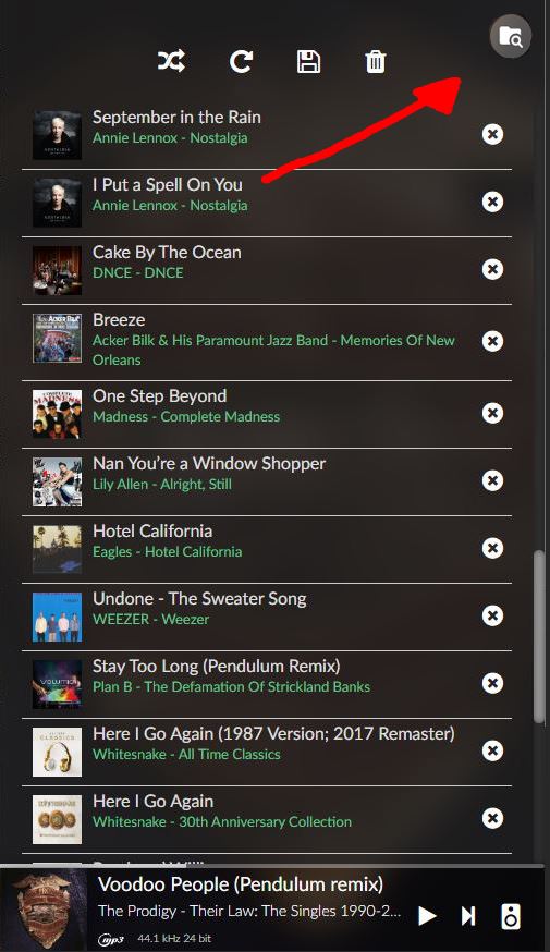
I like the proposal very much. With an additional row of icons placed on the left side in the current UI I would already be well served (see screenshot attached).
In addition: I would save much more than just this one click if there would also be the possibility to place a shortcut to any point of the directory structure.
2 Likes
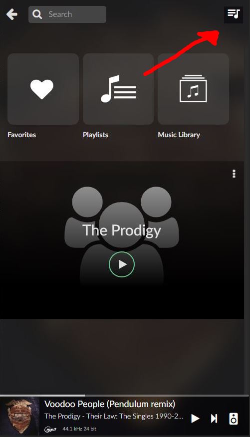
This links in nicely with my suggestion here so I’m hoping that if you only have one source the first/top one is automatically selected.
I’m concerned about how much space this would take on small screens with very low resolutions like the 3.5" Raspberry Pi screen I use.
What I was hoping for would not work at this level, but the one above. Here you are forcing us to choose a source before selecting music. Why? My ‘favourite’ folders, playlists, sections etc might be from several sources. Fundamentally we need direct access to those favourites from the home screen. In the provided image for instance, I might want to ‘favourite’ or ‘bookmark’ Qobuz Top Albums for direct access, not have to go through Source every time. In my scenario I prefer my USB FLAC library and some favourite folders are 3 or 4 clicks ‘down’… THe vast majority of my listening is done via Albums NOT playlists. So I guess I am asking for a ‘bookmark’, ‘favourite’ or ‘alias’ engine depending on your context.
As an addition, I’m sure many of us generally use a SINGLE source the majority of the time, so another suggestion would be to be able to set a custom ‘home’ screen to … well, any source, folder or category we like, really. e.g., for me, that would be Music Library > USB > [USBname] > [category folder]. Thus saving 3 clicks at the start of almost every listening session.
4 Likes
Hi
In Manifest ,a simple idea to make navigation easier, especially for mobile users.
The ability to go from the queue to the search quickly without the need to go back to the main screen then tap search.
Instead of the “close X” in the top right of the search screen can we have a direct link to the queue.
and visa versa with the “close X” on the queue screen a direct link to search.
Both of the “close X” serve no real purpose as if you wan to get to the main screen you tap the song title at the bottom. no need for 2 ways to do this on one screen.
See pics for what it could look like.
4 Likes
Looks great.
BTW
will it be possible to add Visibility for Web Radio like the option „Sources Visibility“
So it is possible to disable Top 500, By genre and so on.