If enabled, it does apply changes with volume change.
As far as I know, FusionDsp is fully open source.
I’m wondering if you are not here just for trolling 
And why would I hack the code to Fusion DSP when I cant get the sliders to move properly under Material UI?
Ok. I made a test with chrome on Android. And you are right. It does not work as expected. Sliders jump to to max value. It works with other UI.
@mervinio any idea?
Will take a look next week
The issue with fusionDSP has been fixed and will be released in an upcoming build.
Big improvement on the previous Interface, well done for the good work. I personally think this is great and more usable.
For context, I only use Spotify connect so I mainly go into Volumio for settings, plugins and multiroom (which I hope, in the future, will allow for permanent groups and let us choose to pick either a group or a speaker like Chromecast used to do. The reason is I have to do a lot of switching around Volumio/Spotify App and add/remove from the group as I don’t always want music playing in the whole house, but that is not the topic here).
In terms of navigation (OSX and IOS). Opening the nav with the burger menu is good but once you’ve opened a section (e.g: plugin) it switches to a pop-up/overlay view and the navigation goes away. So that’s some extra taps/click to move around the sections in the navigation. I know it’s no biggy just not natural for me (hope this makes sense)
I’ve also put Volumio on my phone home screen using the Safari option, Works really well and it’s nice to get that App feel instead of having to open the browser. So thanks for thinking about mobile views. I would just put more space at the bottom in that view but that’s just being picky.
The volume sliders in multiroom/group view are quite small and fiddly so I always have to switch to the device view to access the bigger slider. I have to do that to align volume across devices as some have hardware volume and some haven’t got any (volume is on the amp).
On the switching devices through the Speaker/Group section. It’s super useful, just sometimes not sure which Speakers/Devices I’m on, maybe having the device name somewhere on the player would make it more obvious to me.
As a suggestion for others. If you are giving your opinion and not reporting a bug, I would recommend explaining what you are trying to achieve and why the current interface doesn’t allow you to do it. If the designer gets context they will be able to create better solutions.
Well done again, I’ve paid for a year of Volumio and looking forward to seeing updates coming through, it’s also so much snappier in terms of starting and stopping music, no more of that little jitter in V2. I hope more people will commit and support this project. 1 month of Volumio is £4, that’s the cost of a pint (or cheaper than a pint if you like good beer). For me, it’s a no brainer and a good price
I can only agree, the new “Manifest” interface is really great and worth every penny!
I noticed that the changelog for v.3.198 included “Several improvements for Manifest UI”. I haven’t spotted what they are yet and am curious to know what’s changed.
The only thing I spotted is that the options are back when you click on multiroom in sources.
I’m really very happy with the manifest interface!
I would like to note that if the multiroom function is deactivated in the settings, the multiroom area should not be visible on the right. - This device with deactivated multiroom should also not be visible on the other Volumios with activated multiroom.
Would this be a suggestion for improvement?
But only for the grouping part, we don’t want remote control to disappear
Indeed don’t want to loose my phone… 
Great, that artist information is shown in the Manifest UI - i love that.
While trying to read that for the Artist “Down To The Bone”, where there is information available i had to wait 4 times for the automatic toggle between artist and label information to read the whole artist information, while the label information is very short for the time it is shown.
I’d suggest to increase the time while artist information is shown - while the time while label information is shown could be decreased.
Or simply increase the toggle time - maybe user definable ?
Hey! Another DTTB fan! 

Hi mcewan71,
 may i kindly ask what DTTB stands for ?
I guess it is not meant „Deutscher TischTennis Bund“ 
Br
Josef
You started it 
ahh - ok  - yes, they are great.
I’m not used to abbreviate wonderful band names 
And how about: Unemployment Benefits 40?
UB40 ? - i guess
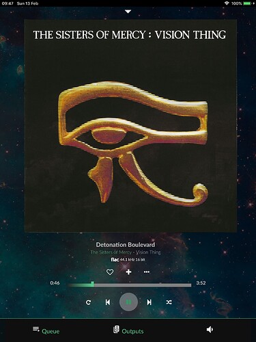
I’ve been looking at Manifest while considering the upgrade. Maybe this is an edge case, but I use an IPad as interface. One neat feature of Contemporary, is that when you turn to portrait mode, you get a near full screen album art display.
I use this a lot as the ‘now playing’ screen.
However, in Manifest, the album art is even smaller than landscape mode!
So, I’d ask for this feature to be brought to Manifest, or even better provide a toggle for full screen album art display.
Sticking with Contemporary for now.
