The SoundCloud plugin, along with Bandcamp Discover / Mixcloud plugins, will have section titles that won’t display properly in the Manifest UI. This is because of the links embedded in the titles. The way they are embedded is really a hack to overcome the limitations of Volumio UI.
When the Manifest UI is finalized, I would have to come up with a hacky solution again. We’ll see…
Very pleased with the new UI! On iPhone (latest iOS) the lower part of the screen is somewhat crowded. Moving the buttons and progress bare a bit more upwards would help. For me, the artwork could be larger. It are minor things, and it’s mostly a matter of taste… Many thanks!
look @dvo, it is ok to give critical feedback, that is where the product gets better from. So please do so and give feedback instead of your negative one-liners.
i already written where it sits what it does and how it works do you need more?
i didnt get any responce only that i was negative it was a anwser to michel
and getting nuts from one stupid triggering toaster is just one of the many bugs to solve i guess.
I have one suggestion which would make it even better though. Well, I would say way better, at least in my opinion
Swipe down to go to the ‘‘home screen’’ of the Library (sources)
At the moment when I search for some music and want to switch to another source, it doesn’t make sense. I just keep on clicking the back button many times: back to album, back to artist/playlist, back to Tidal (for instance), back to sources/library.
There is currently no swipe down gesture, so I guess it would be quite easy to implement this.
Me too. I also have found a green disabled back arrow on a panel which also has a close window ‘x’ so a few minor navigation issues. A home button sounds like a good idea.
And also many thanks very much to the developers… looks very nice.
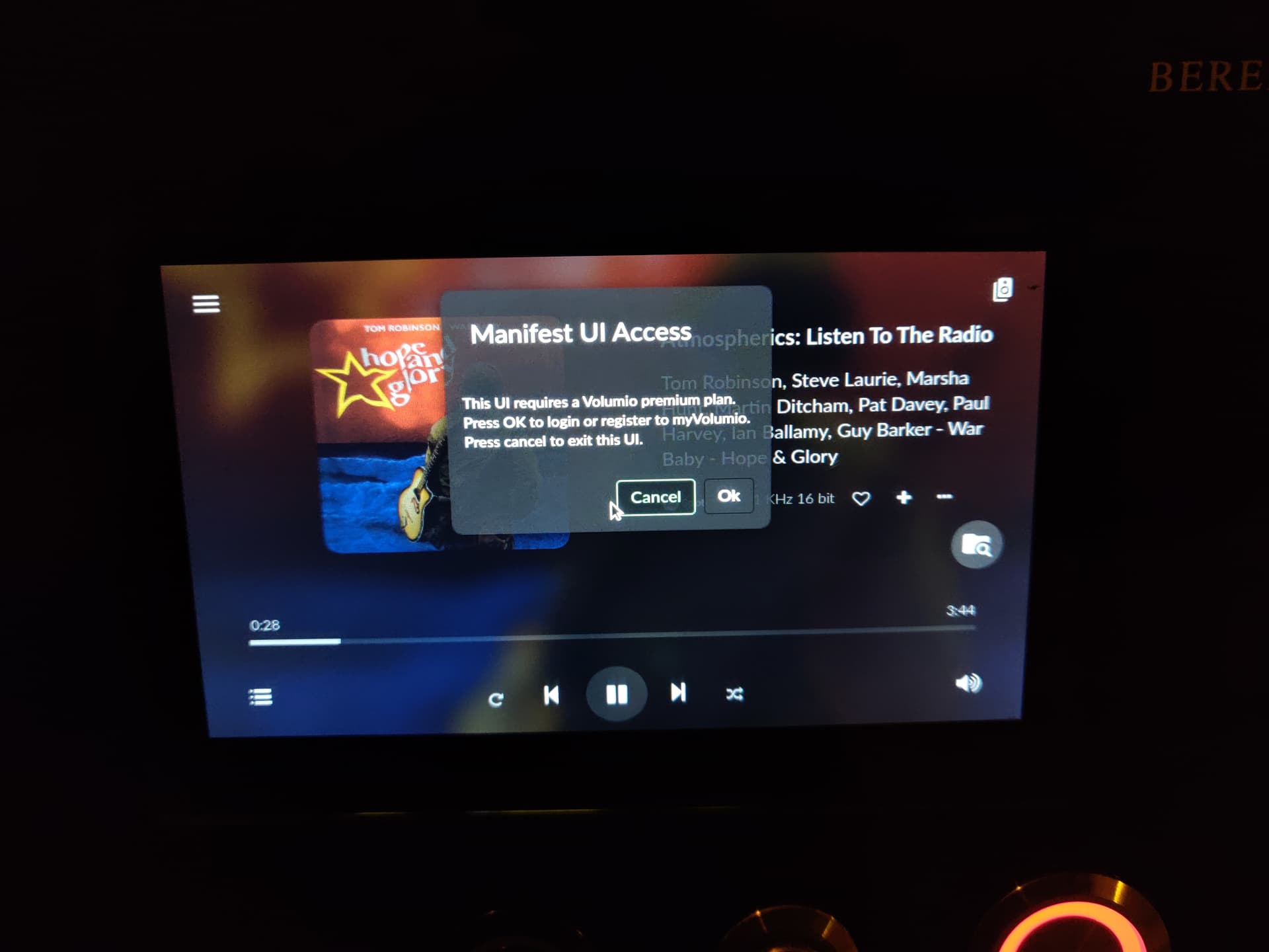
Yep, one thing that was not clear enough was why you were redirected to login every 30 secs if you did not have the premium plan. So that’s why this was added
yups first they want you to look and test and forgot to say its a premium option,
if they would do the next premium release say it in the title / post so everybody knows
then nobody without a premium account would test it.
and i would not switch to 3.150 for nothing.
I tried Manifest today and it seems quite nice, with a cleaner and less cluttered design, but there are a couple of small things I would like to see fixed/improved.
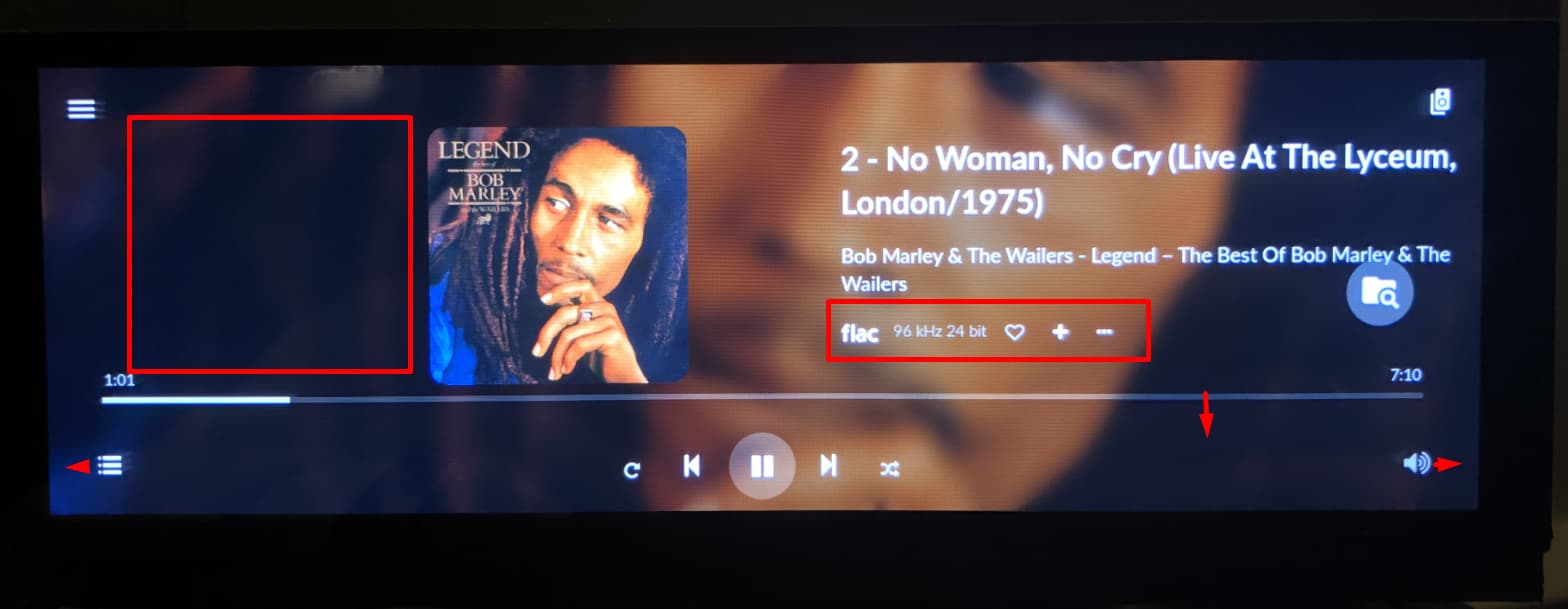
The main issue I have is that the volume control can be too slow to get to. If you choose a new radio station and the music is a bit loud you have to first close the station selector panel at the top of the screen, then scroll down to the bottom of the screen to open the volume controller and then finally move the cursor back up to adjust the volume. If the music is too loud that’s an annoyingly long process. I would recommend a permanently open volume slider in all the main selection/playback views.
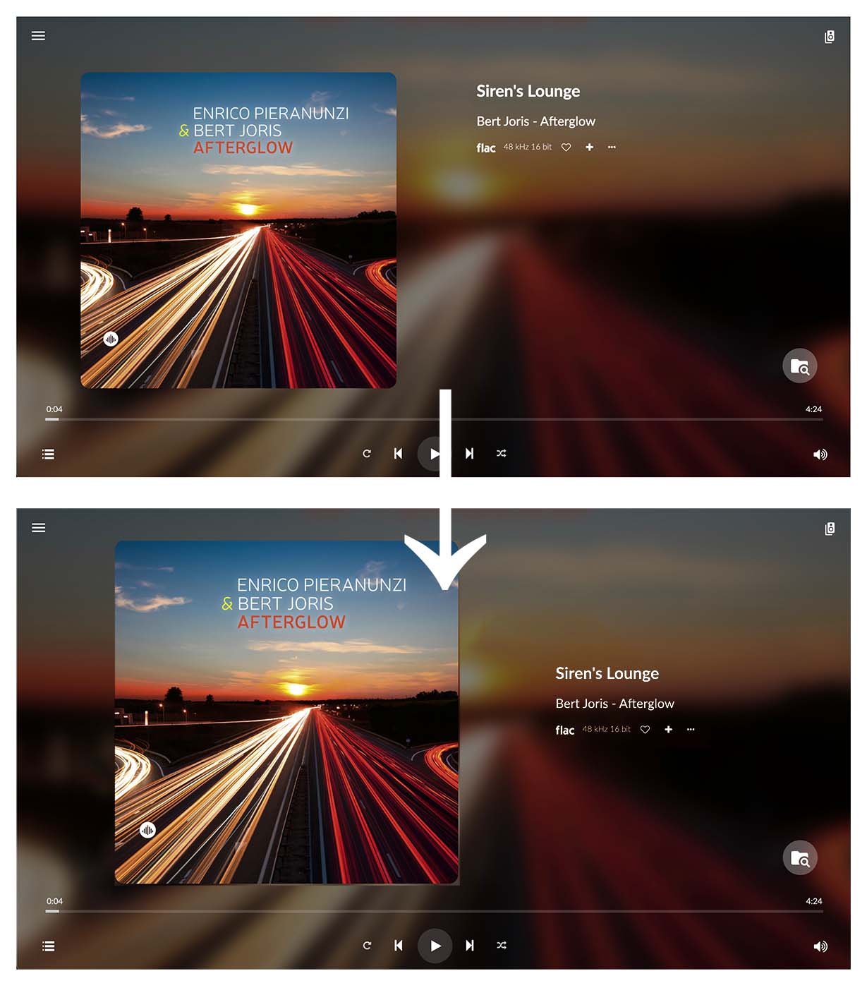
Secondly, for the desktop view, I would love to see the album artwork a little bigger and moved more towards the centre, with the text moved to the right and down, something like this: