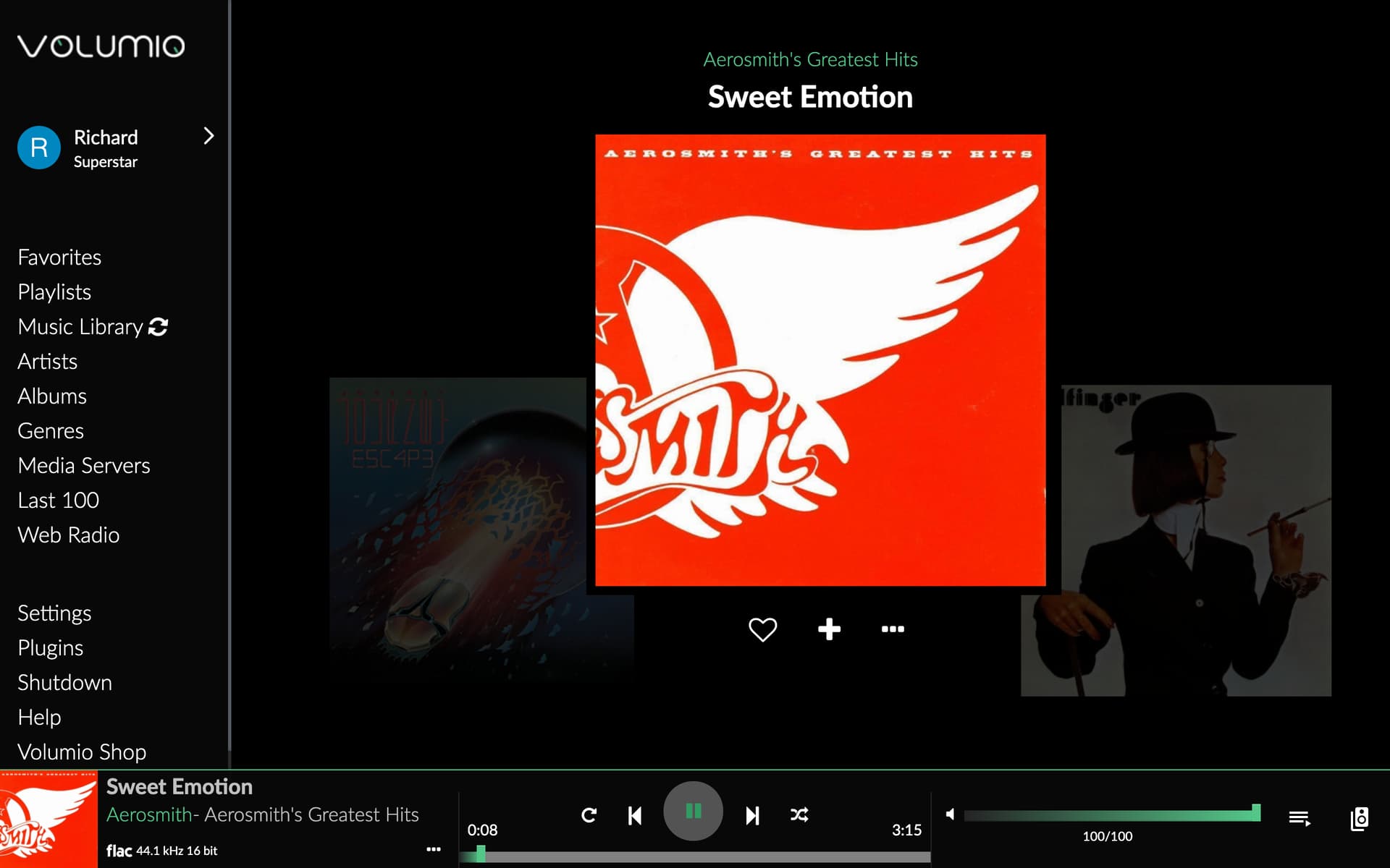
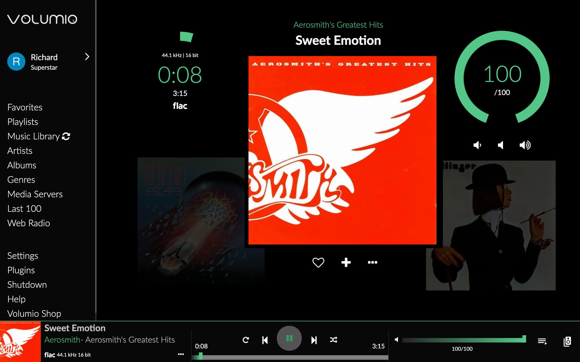
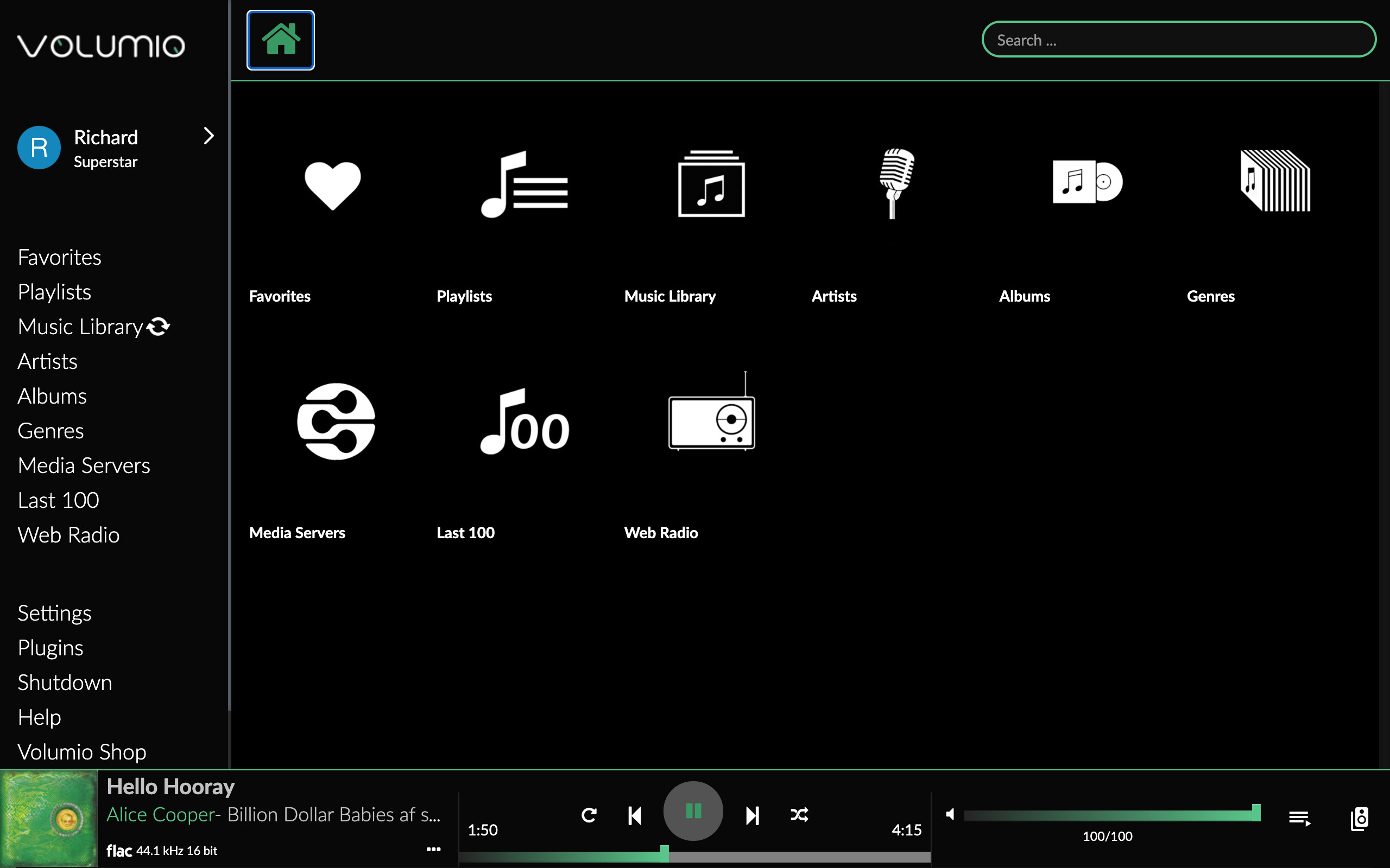
Here are two concepts for the main screen.
Previous, Current Song, Next Song. Album Art.
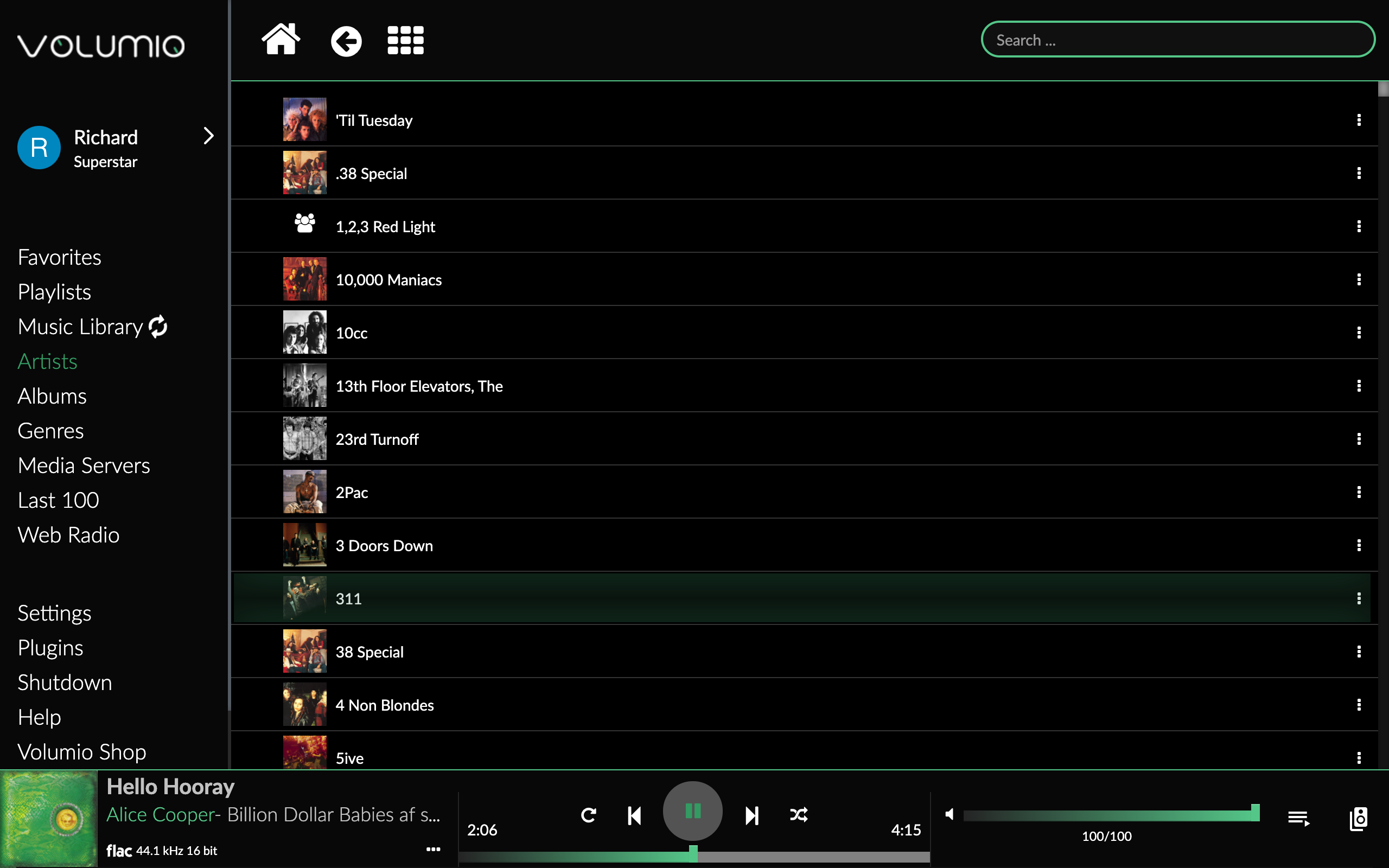
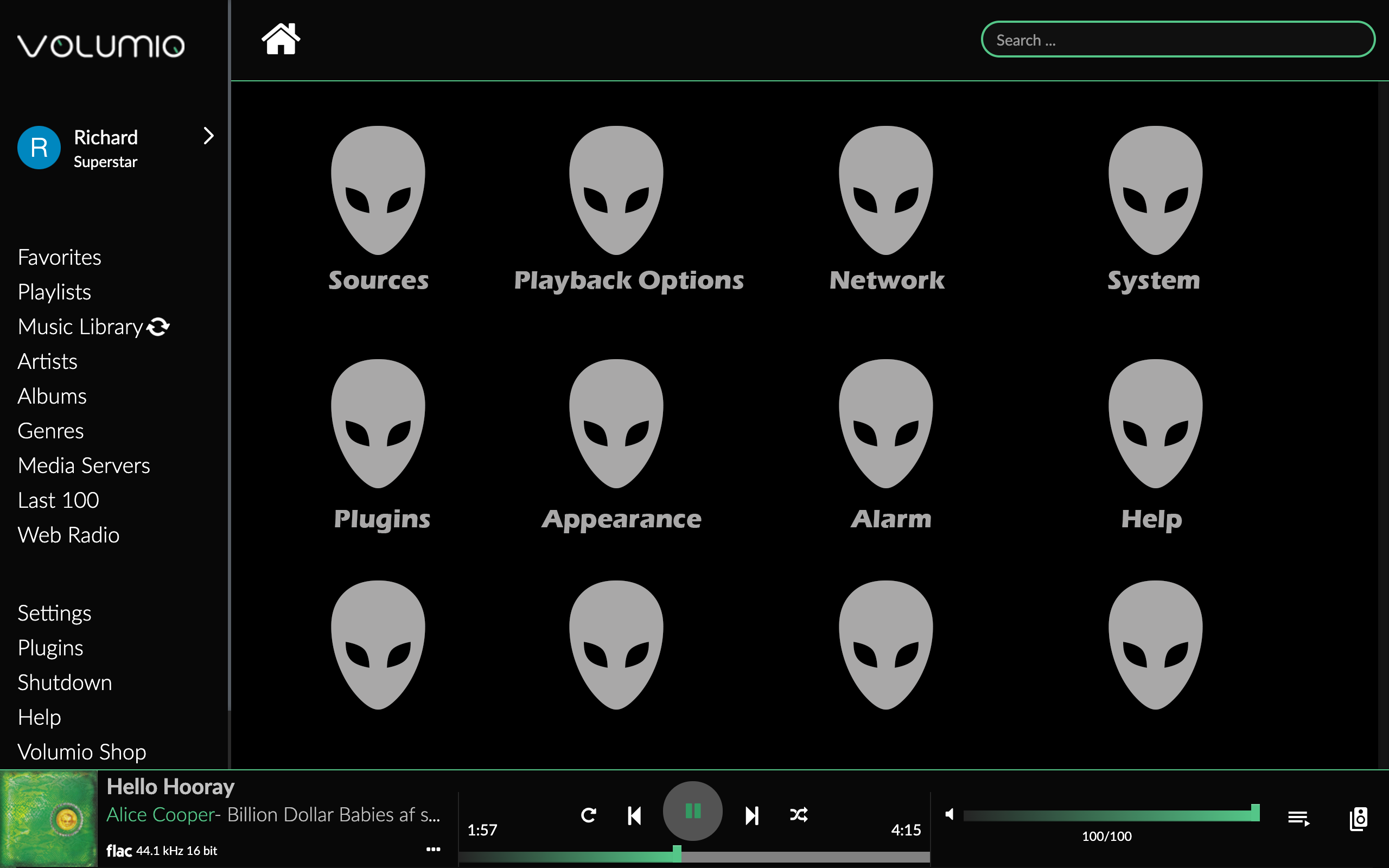
Noticed on Volumio 3: Alignment issue on Text to Icon. Needs CSS code edit
What i think it should look like:
Superstar customer should unlock color themes, my suggestion is use a name of a song that will make it more music like instead of green, red, blue. Since the main purpose of Volumio is to enjoy music.
Volumio — Standard Color
These colors are named after popular 60-80’s Songs.
Baby Blue — Nice Blue Color
Purple Rain — Nice Purple
Crimson & Clover. — Deep Red Color
Mellow Yellow — Yellowish Color
White Rabbit. — White Color
Fields of Gold. — Gold Color
Orange Crush. — Orange Color
Brown Sugar. — Light Brown
Green River — Darkish Green
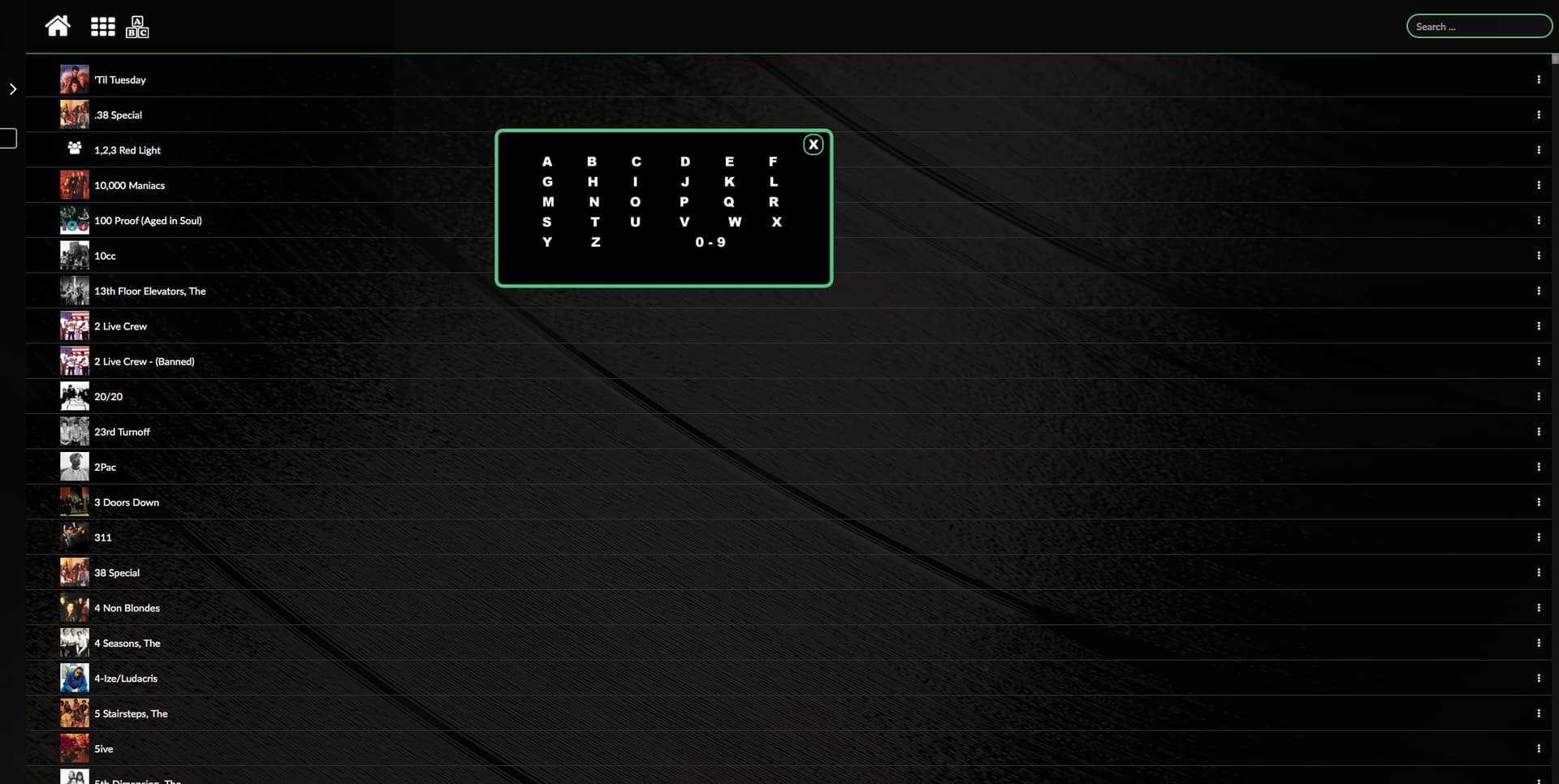
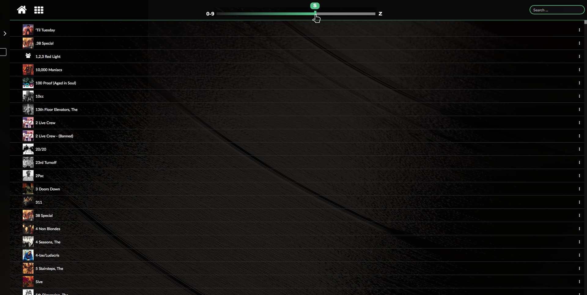
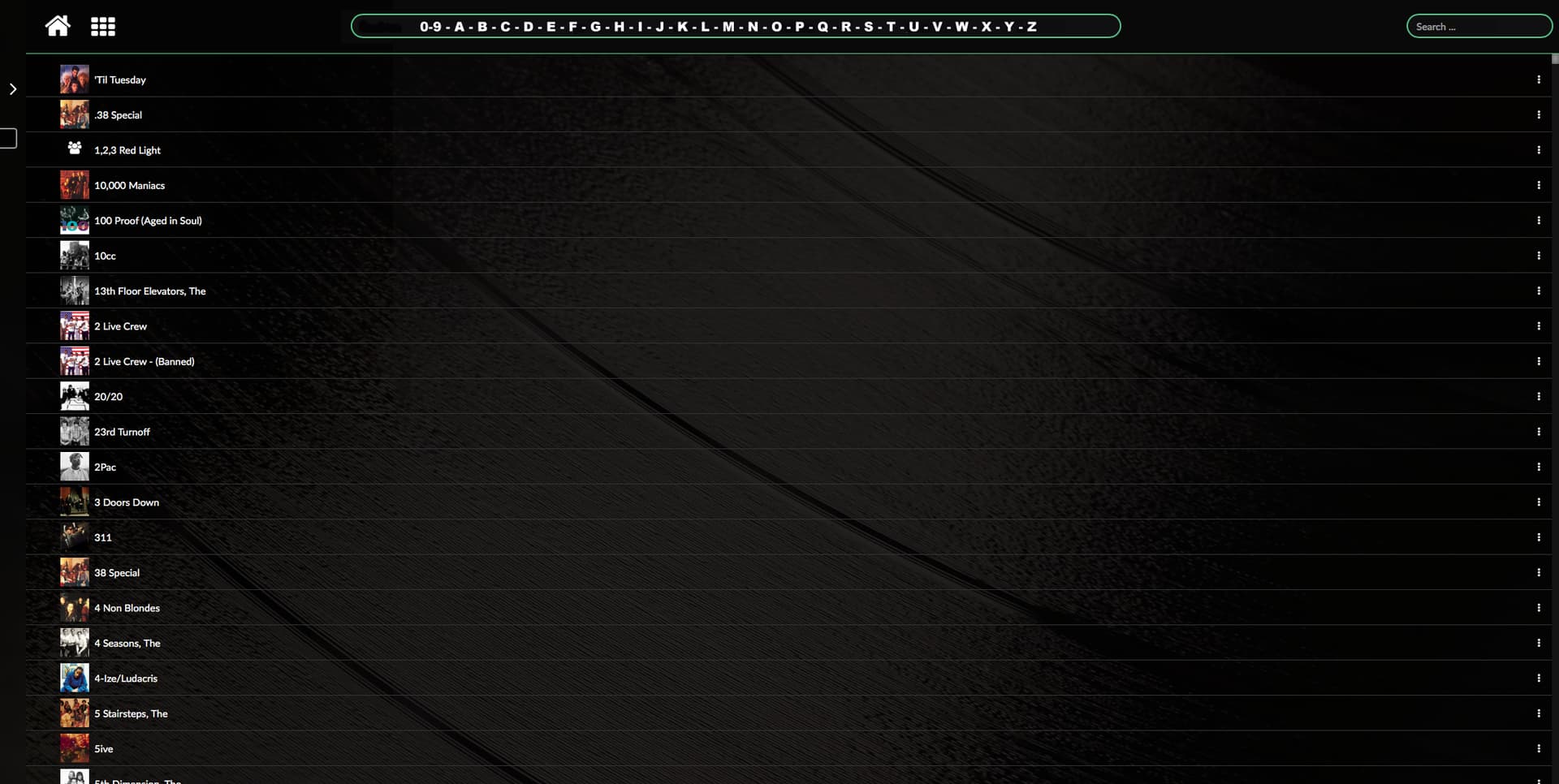
did you try this
this would give you a way better look …